Challenge
Create a visually compelling concept for Abbott Laboratories' Diversity, Equity, & Inclusion book cover report.
Solution
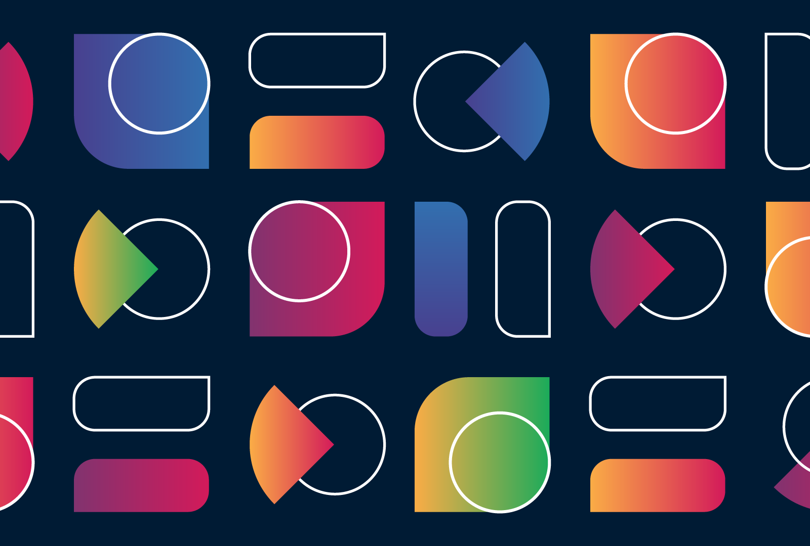
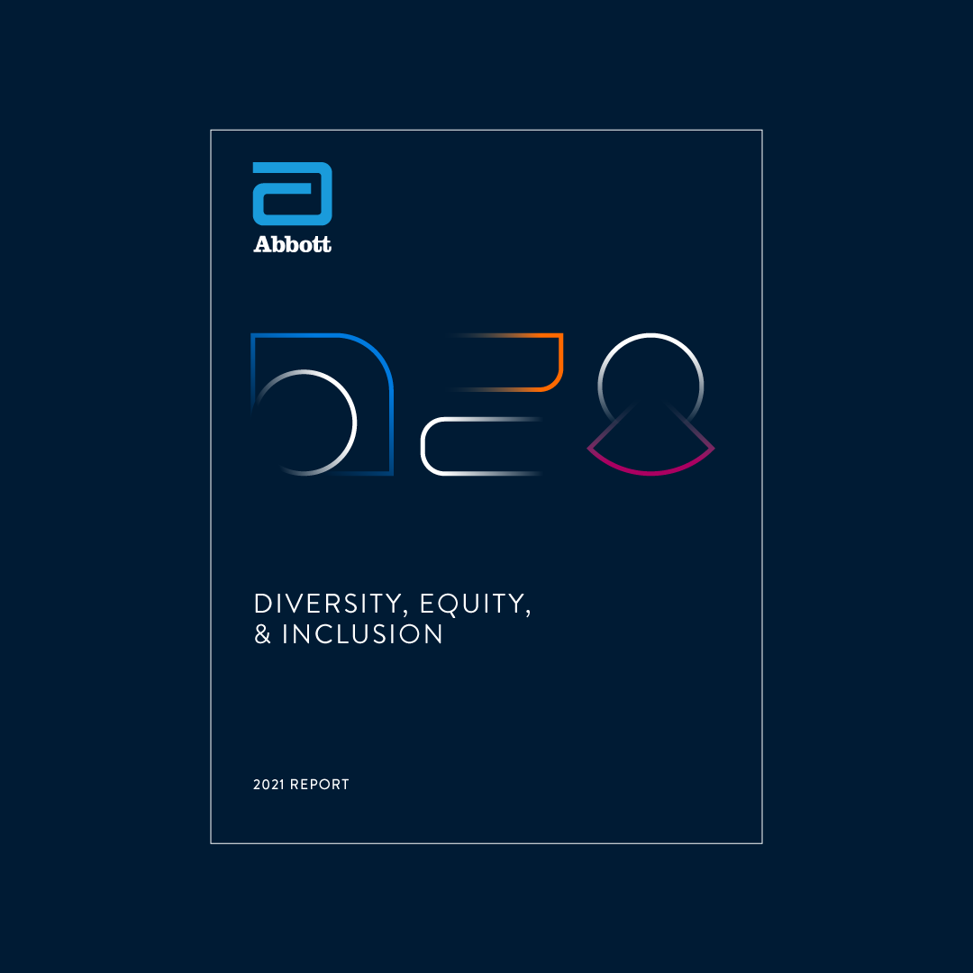
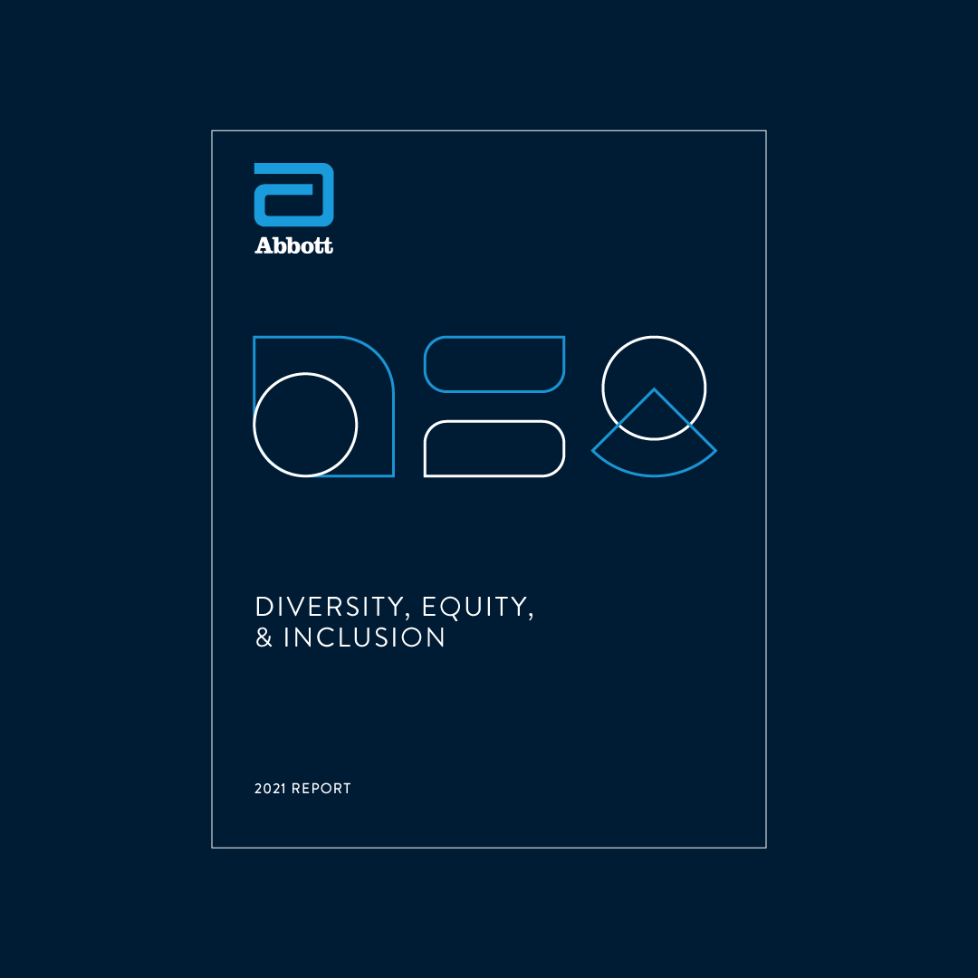
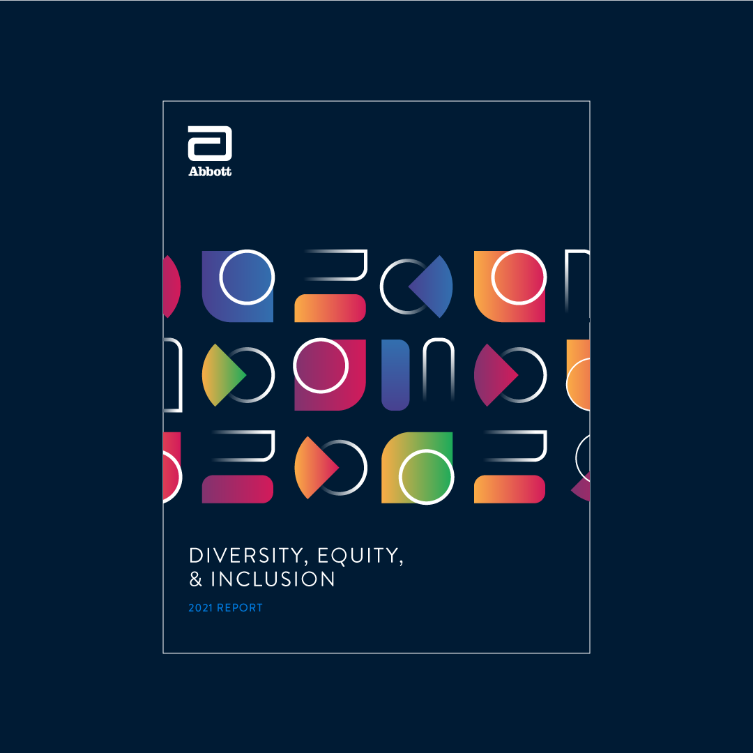
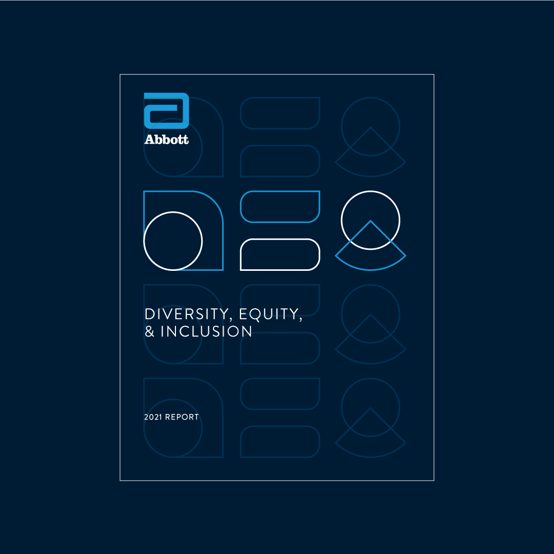
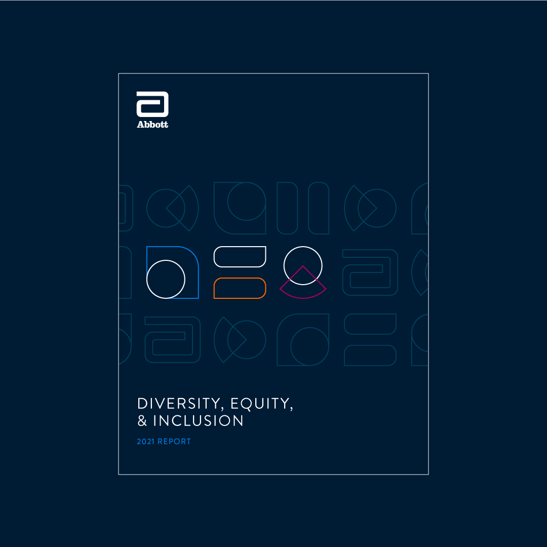
The aim was to create a visual representation of the acronym DEI that captures the essence of each letter. The 'D' features two distinct shapes to symbolize diversity, the 'E' uses an equal sign to represent equity, and the 'I' incorporates a stem that extends into the title (like the dot on a lowercase 'i') to signify inclusion. Using these shapes as a foundation, I developed a pattern that seamlessly integrates Abbott's logo.
Scope of Work
+ Concept Development
+ Art Direction & Graphic Design


"The benefit of expanding social justice knowledge as designers is that the messages communicated become more inclusive. When thinking is inclusive, it enhances creativity and the ability to generate more ideas and better solutions—which in turn activates the ability to be innovative.”