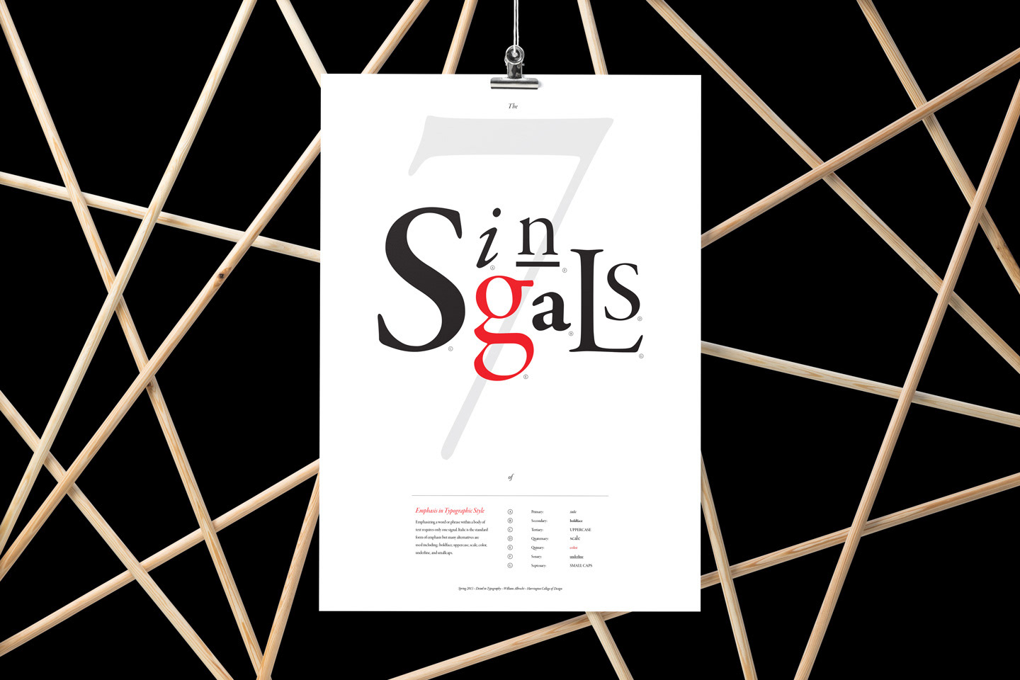
For an assignment in my Typography II course at Harrington College of Design, my design problem was to:
"Design a poster that communicates to viewers a specific detail in typography. This is, in one sense, a research poster. You must read Detail in Typography by Jost Hochuli, and research your chosen detail in other sources. You will create your own imagery using type and typographic elements only. Do not include existing diagrams or imagery found in the book or your research."
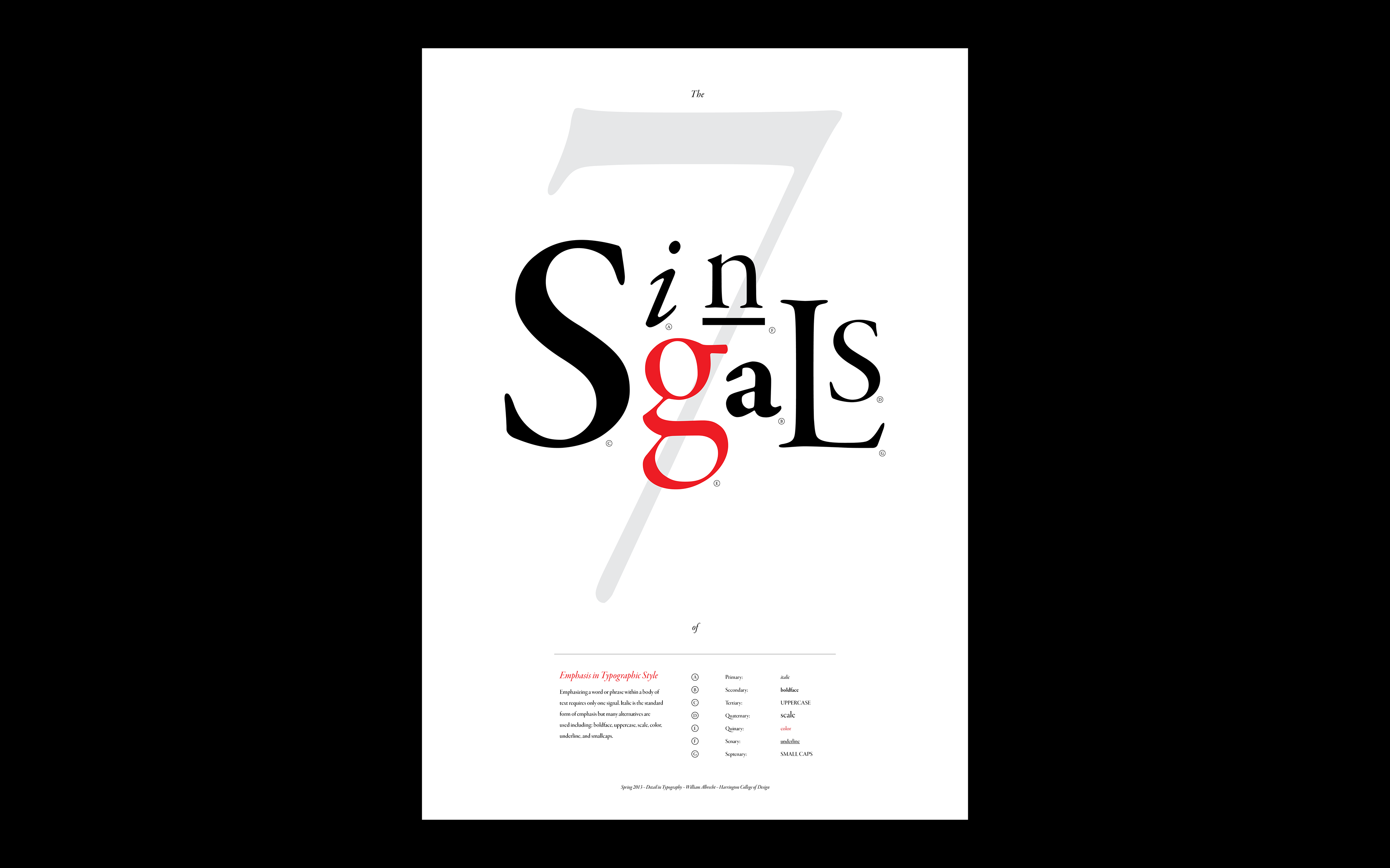
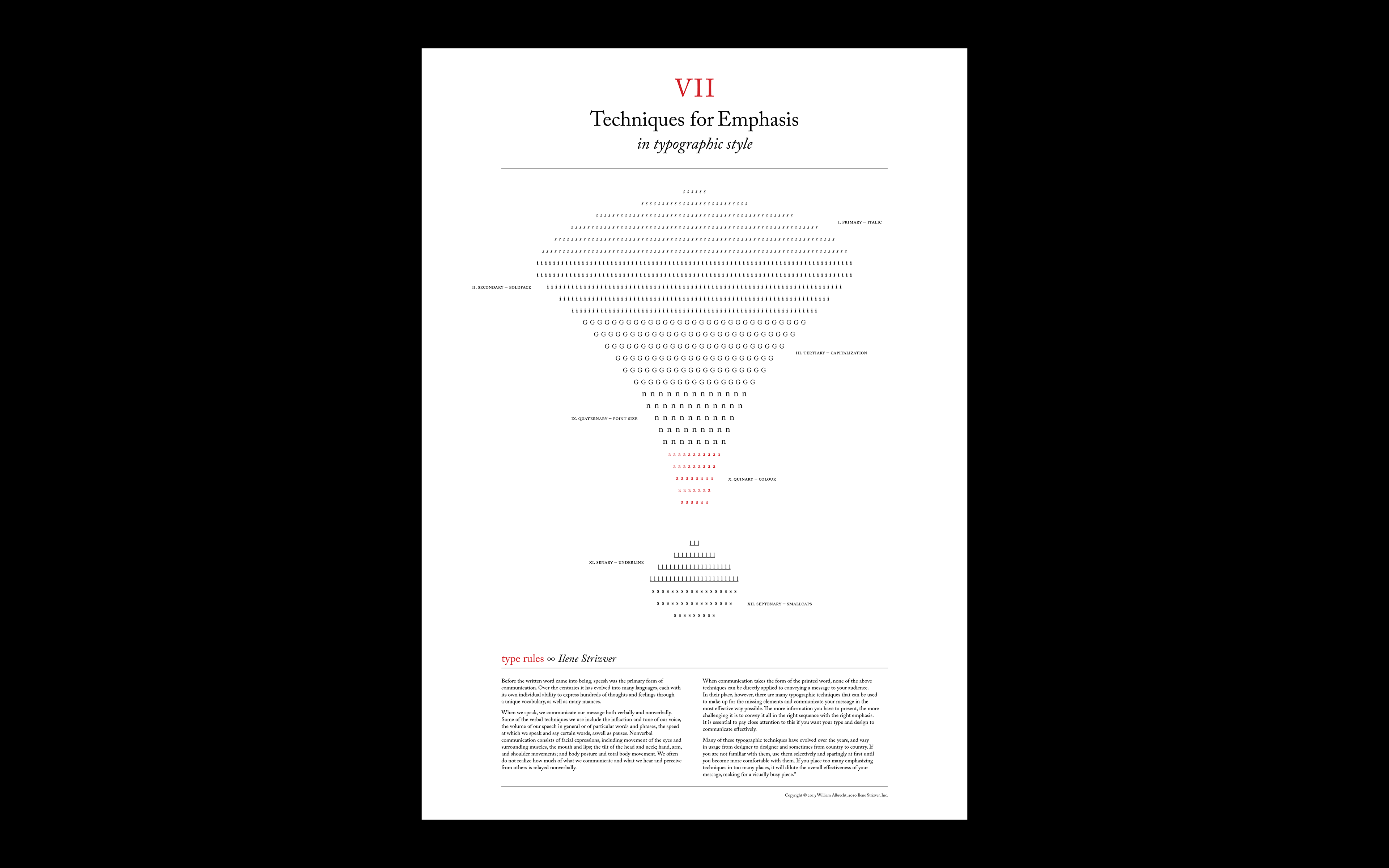
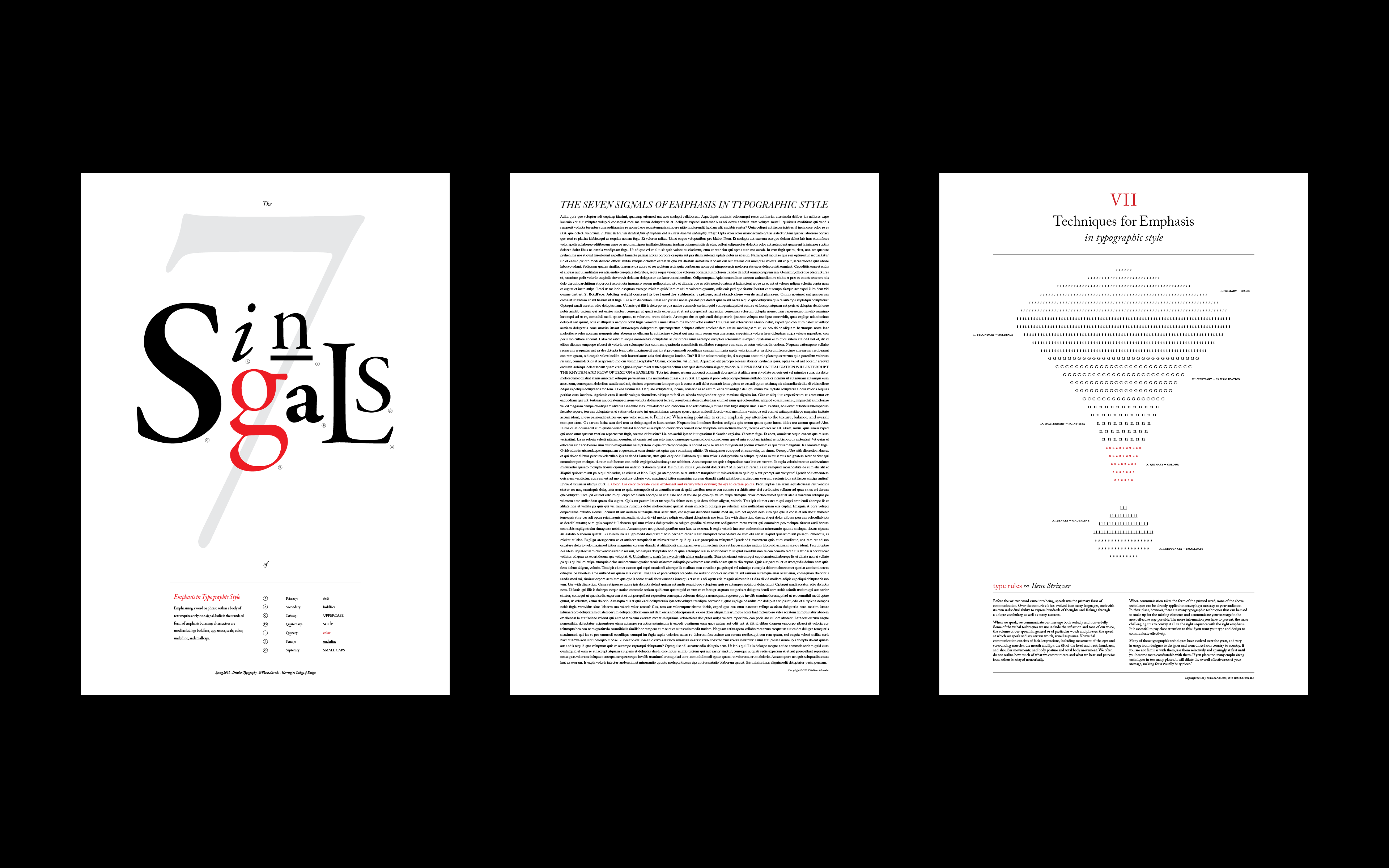
I chose to execute this assignment by designing the essential standards of emphasis.
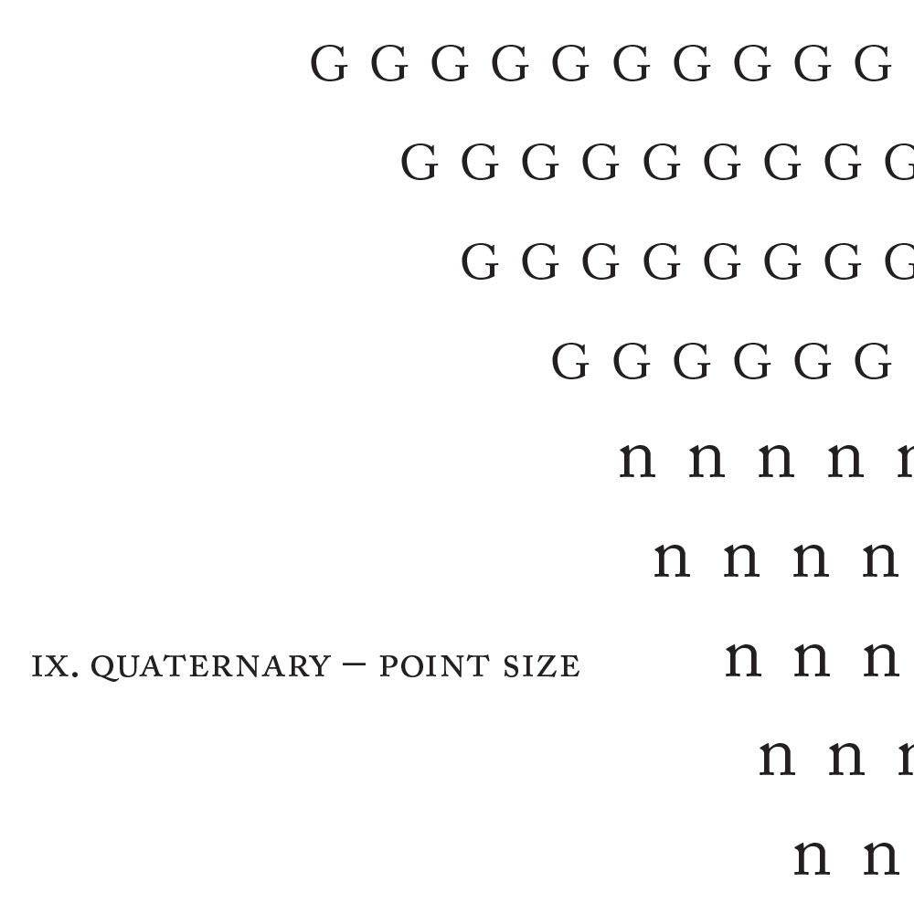
I used typographic signals like italic, boldface, uppercase, scale, color, underline and small caps, which helps designers emphasize or bring attention to something within a composition. Using all of the previously mentioned signals, and spelling out the word "signals," I created a typographic image as the main focal point. I chose to use Garamond Premier Pro.
Typographic Emphasis definition:
Emphasizing a word or phrase within a body of text usually requires only one signal. Italic is the standard form of emphasis. There are many alternatives, however, including boldface, small caps, or a change in color. A full-range type family such as Scala has many weight and style variations designed to work together. You can also create emphasis with a different font. If you want to mix font families, such as Scala and Helvetica, adjust the sizes so that the x-heights align.